How to be One With Nature…In Your Living Room; A UX Design Case Study.
Overview.
The objective for this project was to create a mobile app the helped users deal with the stress of the Covid-19 quarantine. How did nature and being withheld from it, come into play?
Note: This was a team project assigned during User Experience Design Immersive course at General Assembly and is in no way affiliated with Google or Google Earth.
My Role:
UX Researcher | Designer | Scrum Master Duration: 10 Days
Project Status: Complete
Hypothesis
When my team (Julie Kim, Olana Brooks, Lenny Chen) and I were assigned this project, it didn’t take long to align on our hypothesis and our assumptions, especially as we were living through the quarantine together, but apart. We personally felt that is vital for people to be able to decompress to stay healthy.
What happens when it’s not accessible, given time, or our current situation? Perhaps there is an opening in the market for a nature based relaxation app that allows users to view nature videos and live streams to help decompress and relax.
…and Assumptions.
Watching natural phenomena and animals brings relaxation to people.
People don’t always have access to see or experience natural phenomena in person.
People want to watch live stream videos of natural phenomena and animals.
User Research.
Our research goals were immediately clear:
Are people really more relaxed after watching natural phenomena and engaging with animals in nature?
Is engagement with nature inaccessible to most?
Is a nature relaxation app desirable?
How can we help those with limited time and access the natural experience they crave?
Affinity Map.
We began with a series of interviews (8 in total) of potential users of our app. We asked about their daily stressors, how they decompress, and their feelings toward nature and their access to it currently.
From there we were able to synthesize (or compare, contrast, then combine) data from those interviews to form an overall big picture in what is known in the industry as an “affinity map”.

Affinity Map
What we Learned.
We ultimately learned that users do feel as though connecting with nature is beneficial, and as we believed nature experiences weren’t always accessible, even before the pandemic. From there we began to develop a direction on how to create an app that would be both useful and helpful for users.
Users feel that connecting with nature has emotional and physical benefits.
Experiences with nature aren’t readily accessible to most users.
Users need frequent relaxation activities.
Users do seek out ways of connecting with nature virtually when they don’t have physical access.
Persona.
Before we began designing the app, we created a persona to help guide us; Maya the Manager. We used Maya as a representation as our core user base and to referenced her goals, needs, and frustrations within our design process; a constant reminder to our user first.
Maya is 36, a project manager at a marketing firm, wife and mom to two young kids. In the small amount of time she has to self care she exercises with nature sounds, and longs for a time solely dedicated to her family and being outdoors.

Maya the Manager
Journey Map.
After we developed our persona Maya, we wanted to hone in on what a day in her life would probably be like. Our User Journey map was used to understand our her better and where our application could help boost her emotional experiences.

Here’s where we identified how we could help Maya:
Our app could provide relaxing content she could view while she is getting ready for work and during her commute.
Our app could also help her stay focused and relaxed while working late.
We could also provide educational content for her to read to her children at bedtime, as well as provide calming visuals as she winds down to sleep.
Partnership.
When deciding on a potential partner, Google Earth quickly became the frontrunner. Why?
Google is a solid innovator that has improved and enhanced the way we receive and distribute information since their inception. With a motto like “education is the most powerful weapon which you can use to change the world”, they were the obvious choice.
Design.
We started designing by first learning more about our business partner Google Earth through building a Business Model Canvas. Then used the data from our user interviews in conjunction with various design techniques to narrow down our most important features for our app. And then we conducted what is known as a “design studio” session to iterate what the app would look like for our mid fidelity screens. We also created these basic product principles to guide our design process:

Mid-fidelity version: Breathr.

The name of our first version of the app was “Breathr” for the idea that what we offer would give users an opportunity to relax. A “breather” of sorts. Our home screen includes a featured today and new video tiles, and we also have the capability to explore new places and nature through the google earth view page.
(Wanna give it a go? Link to Figma prototype can be found here.)
Insights to Features | Mid - High-fi.
We asked five people to participate in our usability testing. We asked our participants to complete 5 tasks using our app. Task 1 had a 100% success rate with an indirect path. Tasks 2 and 3 had 100% success with a direct path. Task 4 had 100% success with one indirect path, and Task 5 had an 80% success rate with one failure to complete. Even with our successes, we came away with some great insights on ways to improve our app even further:
Rebrand “Breathr” with a new name that emphasizes the relationship to nature.
Renaming navigation to be more user centric.
Combine “Explore” – Map view page – with our “Search”
Add a more helpful & comforting narrator voice in our design by adding & revising word choice.
Hamburger menu symbol and content (more informational)
Adding a “random” feature for those who have a hard time making decisions

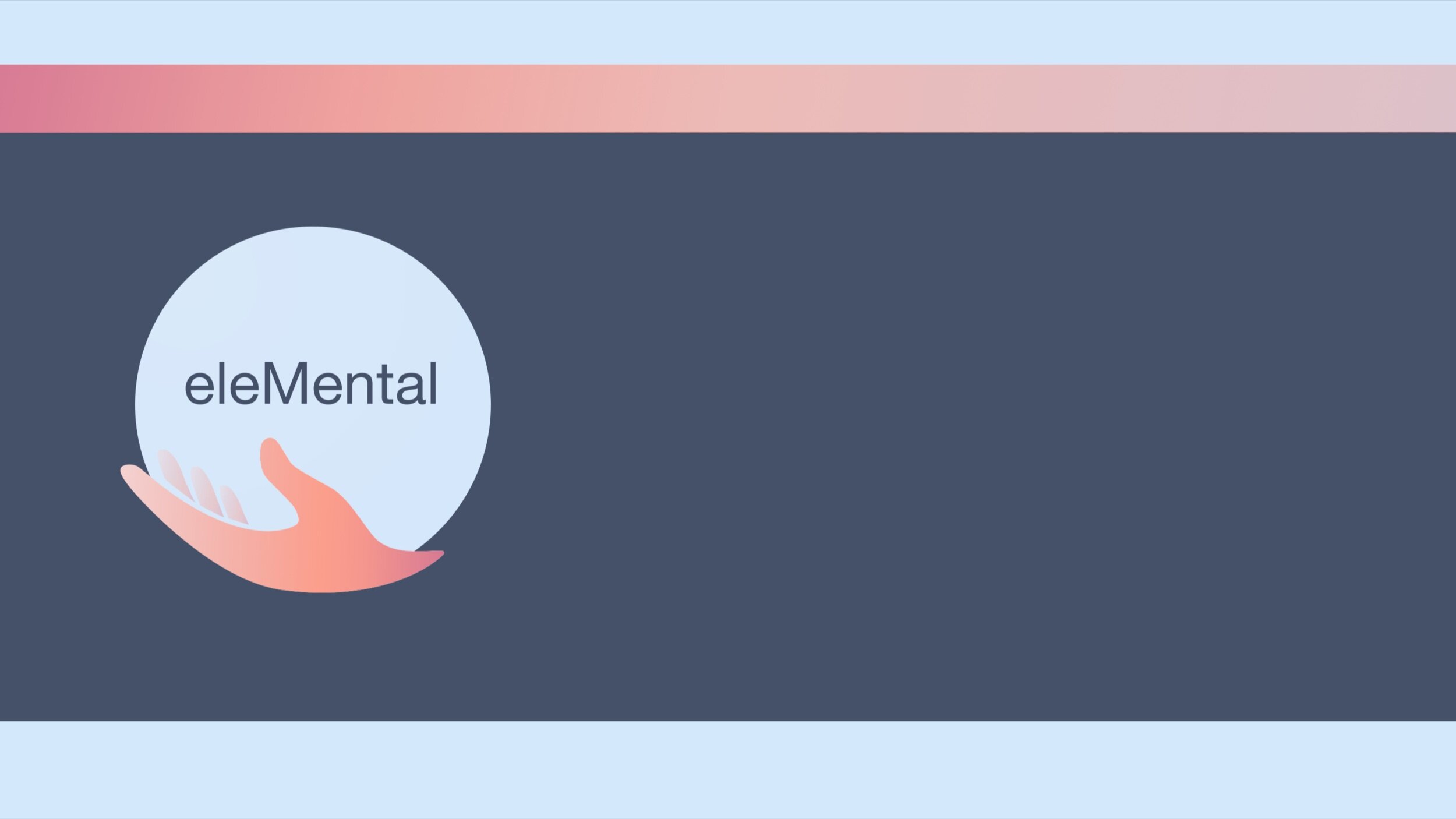
Introducing: eleMental.
After deliberation we decided that our new name for the app would be eleMental. Elements, referencing the natural elements of the earth, and Mental, referencing mental health and self-care.
Testing.
Our second round of usability testing was on the High-fi version of the app. These tests were helpful to see where our mid fidelity to hi fidelity changes bettered the application, and where we still needed to make improvements.

Test Overview.
Our last task using the globe view had 2 failures, which brought the success rate down 20% from round one. While we were disappointed with these results, we believe this could be improved with a more interactive prototype where users are able to touch, spin and zoom in on the globe and treat it more like the familiar Google applications that they know.
If you would like to take the prototype version of eleMental for a test drive, click here: Hi-Fidelity Prototype Link.
Next Steps
If we were to continue on with the project, we would have proposed the following next steps:
Users were interested to see natural locations nearby their current location, which we would include in a high position on the Profile page.
Users responded to our design thinking it was inspiration for travel, so changing our hook and potential labels could help reframe our mission.
Users had to dig further for the earth view, which we believe would be better served back on the navigation bar.
Usability testing again, to inform on new design decisions and iterations.